Not every interface needs to be the hero.
In design, we often default to making the UI more visible: more polished, more expressive, more impressive. But visual direction is not only about making the UI stand out.
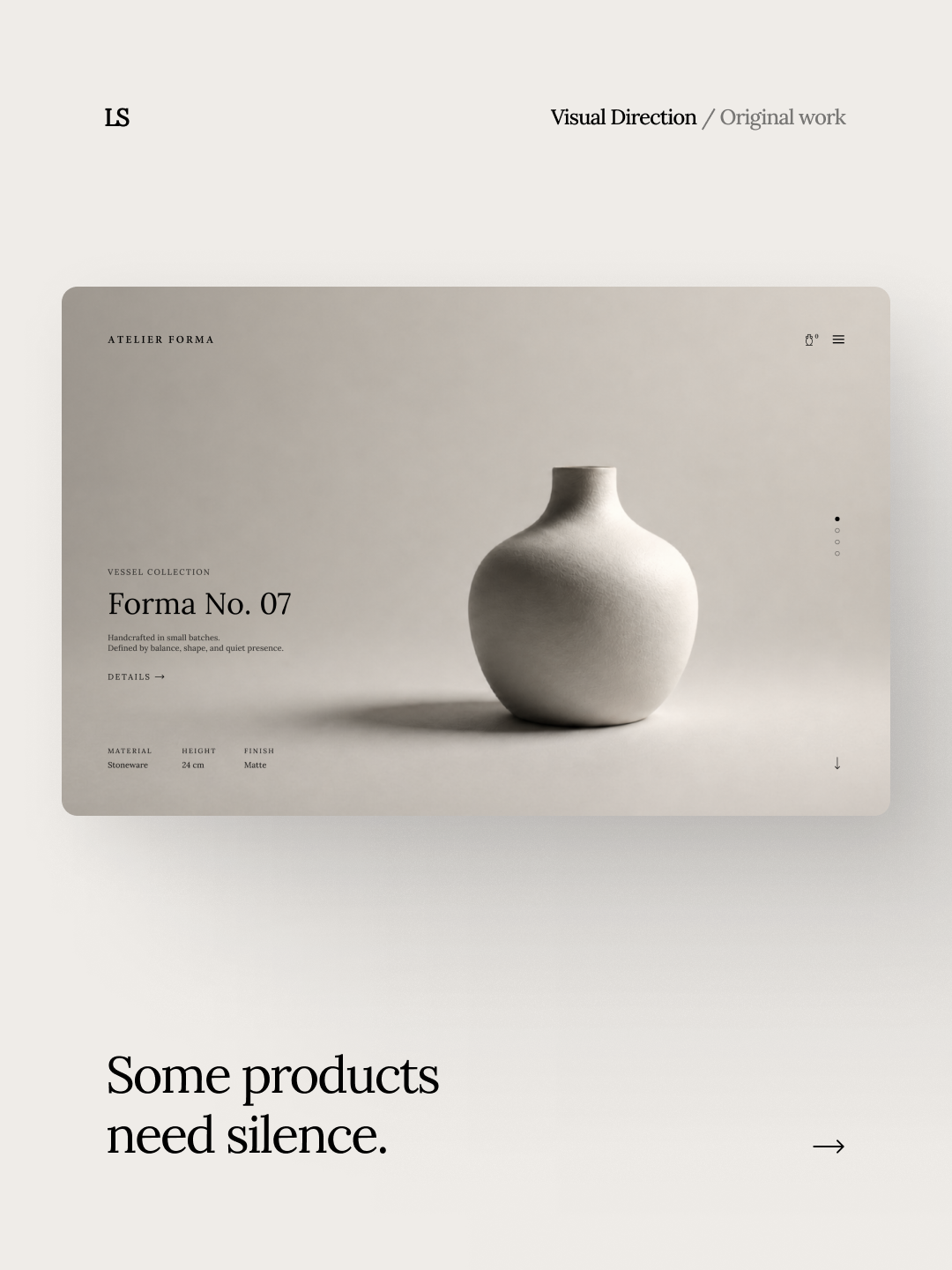
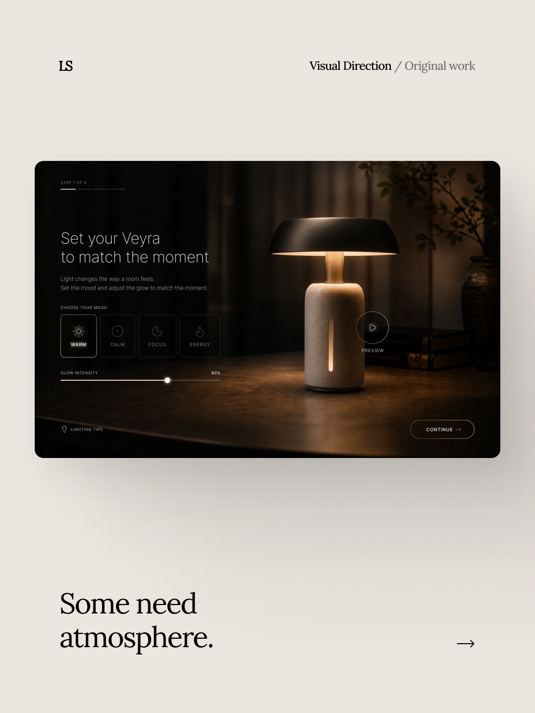
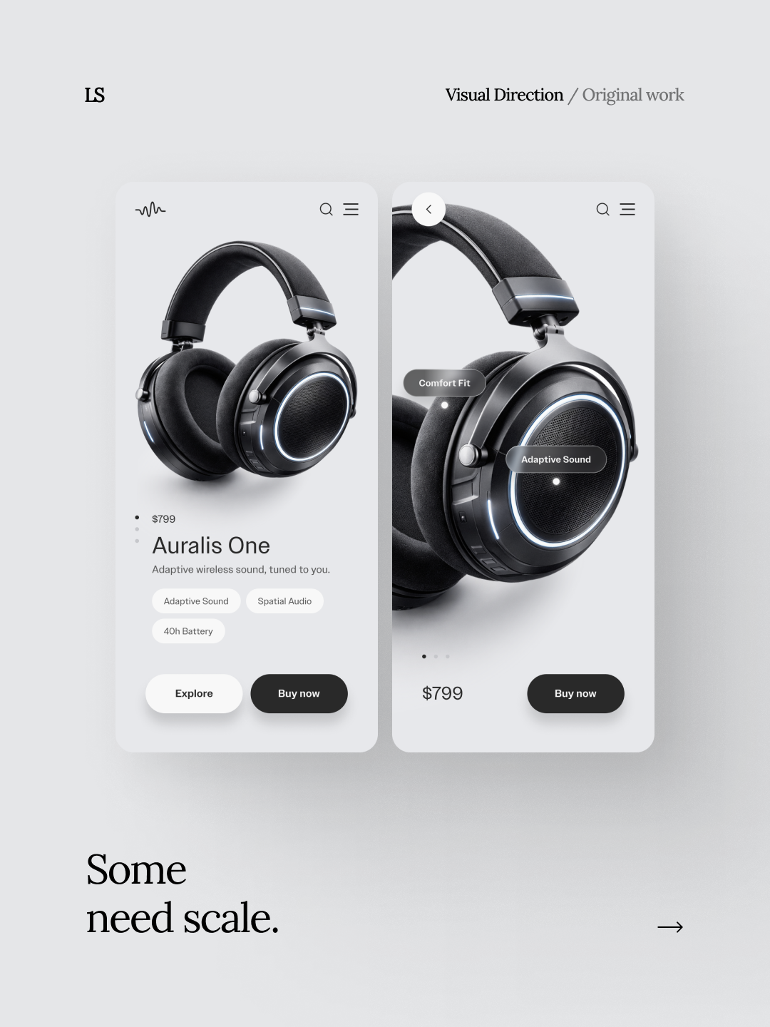
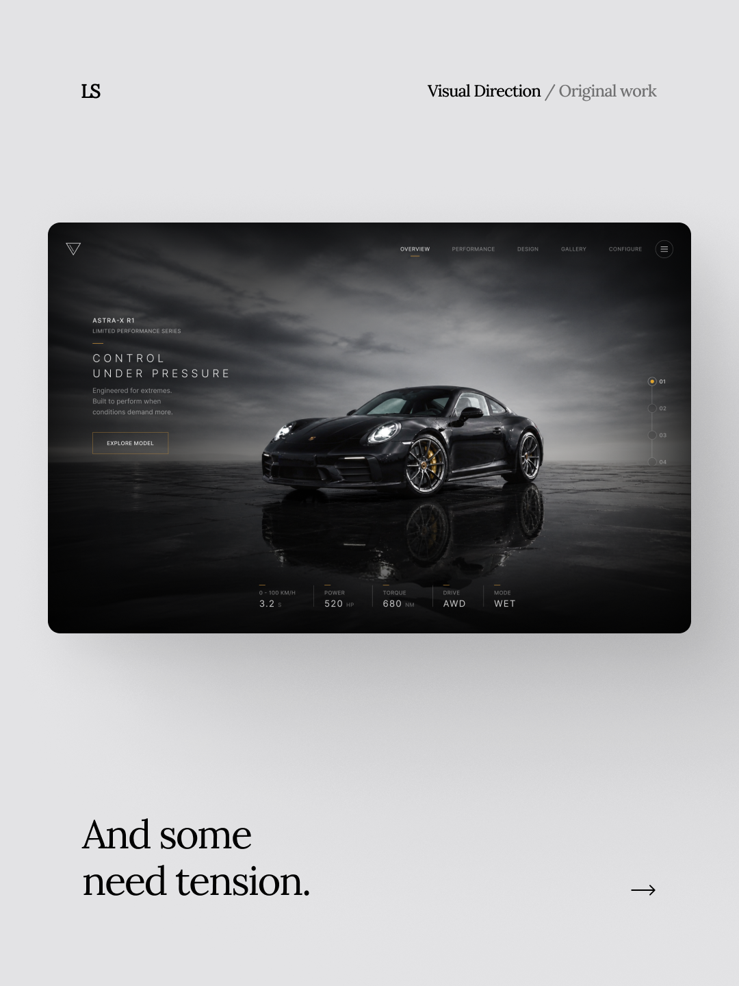
When the product needs to lead, restraint is often the strongest decision. Some products need silence. Some need atmosphere. Some need scale. And some need tension.
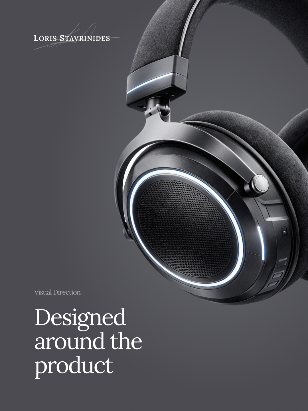
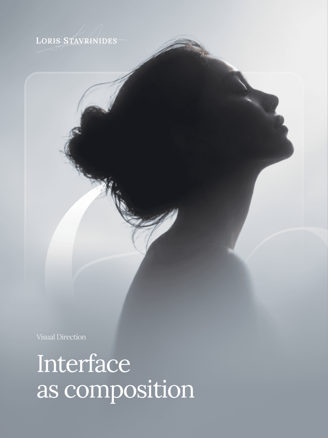
This visual direction study explores how interface, composition, tone, and product presence can work together without allowing the UI to overpower the object or experience being presented.